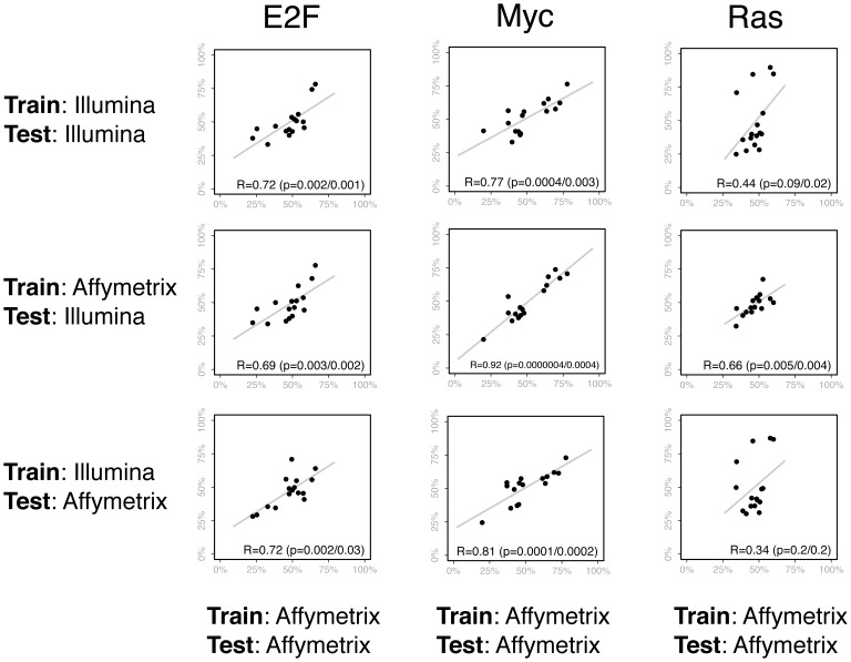
Figure 4. These plots compare the predictions of the E2F, Myc, and Ras pathway signatures when different training and test sets are used.
In the scatter plots, each of the points represents one of 16 melanoma tumor samples. On the x-axis is the prediction of the pathway signature when the Affymetrix data is used for both the training and test set. On the y-axis (for the first row) are the predictions when Illumina data is used for both the training and test set. Thus, the first row shows a comparison between the predictions made from Affymetrix or Illumina arrays. For the second row, the y-axis contains the predictions made across platforms, when Affymetrix is used for the training set and Illumina is used for the test. In contrast, the third row contains the predictions when Illumina is used for the training set and Affymetrix for the test. The Pearson correlations and regression lines are also shown in each plot. Two p-values are reported. The first is from a Pearson’s r, and the other uses a non-parametric Spearman’s rank correlation coefficient to account for predictions that are non-linear.

