Fig. 2.

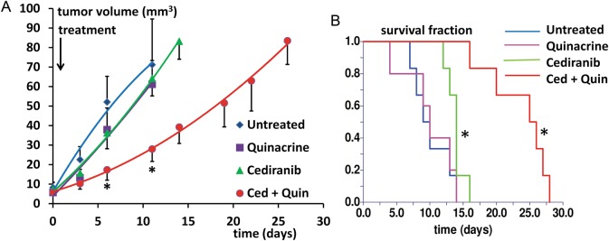
(A) Tumor growth curves are shown for the 4 treatment groups, in tumor volume vs time after tumor growth initiation. Curves are indicated for time points corresponding to ≥50% survival. *P < .05 vs untreated, indicated for time points corresponding to ≥50% untreated group survival. (B). Kaplan–Meier survival curves for the 4 treatment groups (in days from tumor growth initiation) *P < .05 vs untreated.
