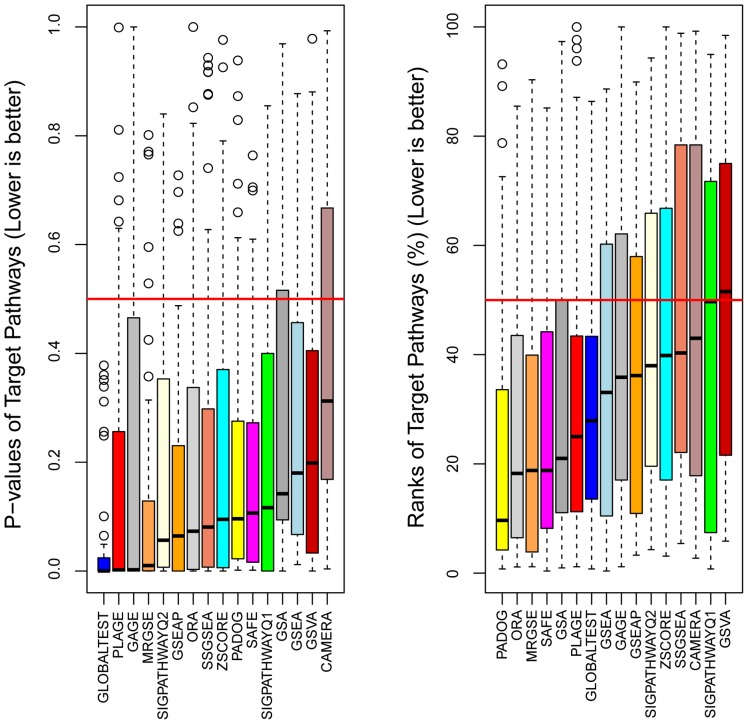
Figure 2. A comparison of sensitivity and prioritization ability of 16 gene set analysis methods.
Each box contains 42 data points representing the p-value (left) and the rank (%) (right) that the target pathway received from a given method when using as input an independent dataset and a collection of gene sets (either KEGG or Metacore). Since the target pathways were designed by KEGG and Metacore for those diseases we expected that, in average, they will be found relevant by the different methods. Methods are ranked from best to worst according to the median p-value (left) and median rank (right).

