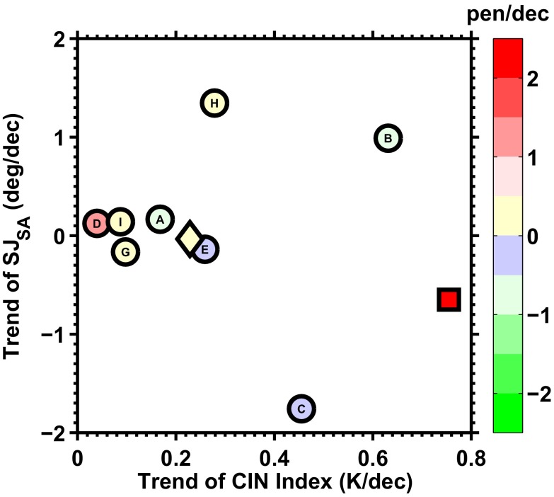
Fig. 5.
Distribution of the DSE trends (color shades) as a function of the trends of the SJSA (y axis) and CIN (x axis) in austral winter for the period of 1979–2005 derived from the historical simulations of the eight IPCC AR5 models (circles) is different from that which is observed (red square). The character in the center of each circle indicates the model’s name shown in Table S2. The ensemble mean of the eight models is indicated by the diamond symbol.

