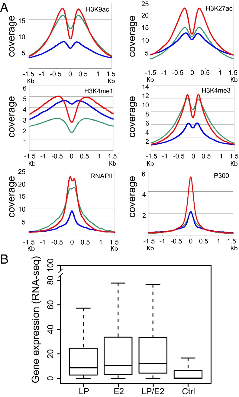
Fig. 3.
Anchor plots for cell epigenetic marks and affected gene expression data. (A) Coverage of RNAPII, P300, H3K9ac, H3K27ac, H3K4me1, and H3K4me3 ±1.5 kb of LP (green line), E2 (blue line), and LP/E2 (red line) sites. (B) Box plots of RNA-seq at LP, E2, or LP/E2 annotated peaks for the nearest promoter versus a control (Ctrl) random gene set. LP, E2, and LP/E2 genes were significantly more highly expressed than control genes (P < 2 × 10⁻¹⁶). LP had lower expression than E2 (P < 0.00056) or LP/E2 (P < 2.7 × 10⁻¹²), and E2 was lower than LP/E2 (P < 0.05). The box plots indicate the data distribution in percentiles, with the horizontal line being the median. The top of the box represents upper 25% quartile (25% of the data over that value), and the bottom of the box, the lower quartile (25% of the data below that value). The horizontal lines at the ends of the dotted lines are the maximum observed values.

