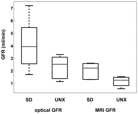
Figure 7. Boxplot of GFR values for each group and method.

Differences between healthy and UNX rats are clearly visible as well as the offset between GFR measured by FITC-sinistrin and DCE-MRI. The boxes represent the 25th–75th percentiles, the horizontal lines within the boxes represent the median. The whiskers indicate 1.5 times the interquartile range (IQR) from the first quartile and 1.5 times the IQR from the third quartile; the circles represent outliers outside the whiskers.
