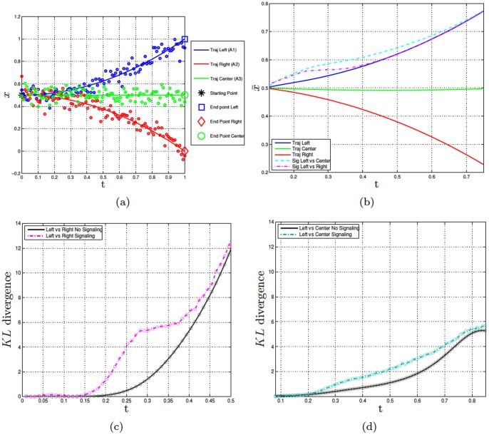
Figure 4. Experiment 3.
Panel a shows the dataset of the synthetic data of the trajectories for actions  (left),
  (right), and
  (center). The lines show the sample trajectories from which the noisy data (shown as circles) were sampled. Panel b shows the means of the original distribution of
  (blue), the means of the original distribution of
  (green), the means of the original distribution of
  (red), the means of the signaling distribution
  vs.
vs.  (turquoise), the means of the signaling distribution
  vs.
vs.  (magenta). Panels c and d compare the KL divergence of the original and signaling distributions in the case of
  vs.
vs.  and
and  vs.
vs.  , respectively.

