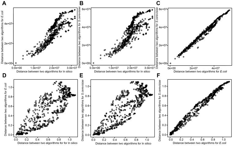
Figure 7. Similarity among gene-expression datasets based on algorithm diversity.
The scatter plots show correlation of algorithm distance between two gene-expression datasets. Each of points in scatter plots represents each of algorithm pairs. Because we have 703 algorithm pairs among 38 algorithms, 703 points are in each of the figures. Vertical axis represents (EUC or PCA) distance between two algorithms for one gene-expression dataset, while horizontal axis represents that for the other gene-expression dataset. (A) Scatter plots of EUC distance for in silico and E. coli datasets. (B) Scatter plots of EUC distance for in silico and S. cerevisiae dataset. (C) Scatter plots of EUC distance for E. coli and S. cerevisiae datasets (D) Scatter plots of PCA distance for in silico and E. coli datasets. (E) Scatter plots of PCA distance for in silico and S. cerevisiae datasets. (F) Scatter plots of PCA distance for E. coli and S. cerevisiae datasets.

