
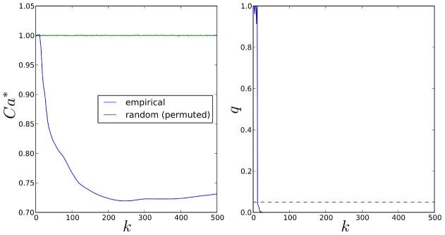
Figure 17. Comparison of top-k SP2 and SiMES gene rankings, for.
 .
Left: Variation of normalised Canberra distance,
.
Left: Variation of normalised Canberra distance,  with k (9) (blue curve), and corresponding mean values over 10,000 permutations of SiMES rankings (8) (green curve). Right: FDR q-values (blue curve). Dotted green line shows the threshold for FDR control at the 5% level.