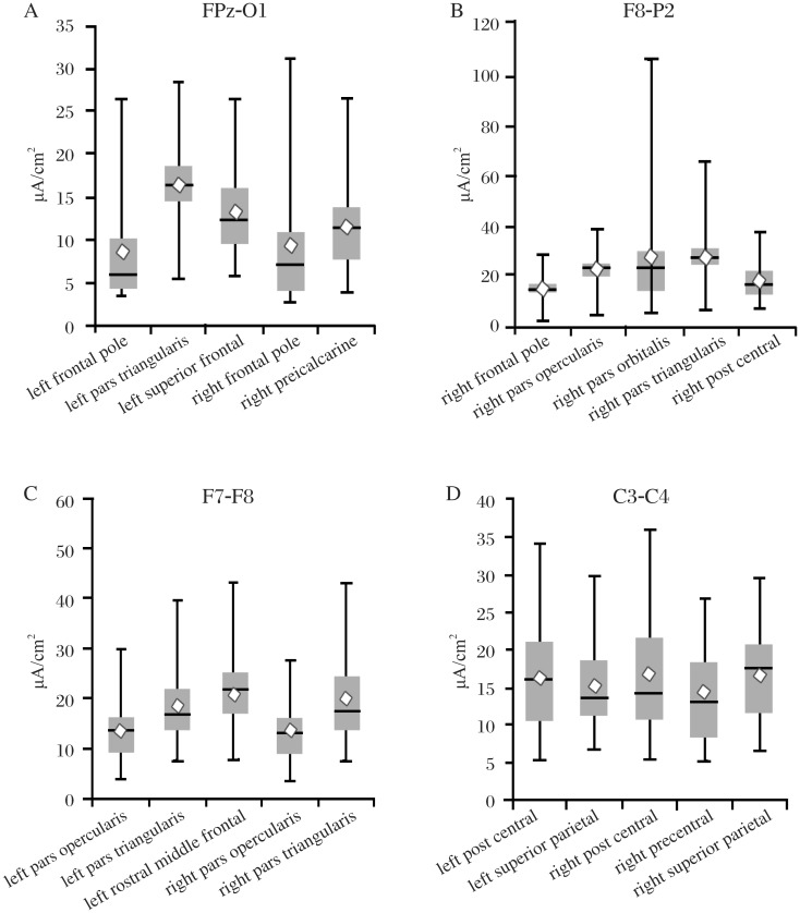
Fig. 8. The box charts and whisker plots show the five areas with the highest level of variance for each of the electrode locations.
The top of the whisker is the maximum current density for a subject; the bottom of the whisker is the minimum current density. The top of the box is the third quartile, and the bottom of the box is the first quartile. The diamond represents the mean value, and the line represents the median value. Note that each chart has a different scale. Seventy five regions were analyzed for each electrode pair and the results are too numerous to present here. Complete data sets are available by Email from: mrussell@aakenlabs.com.

