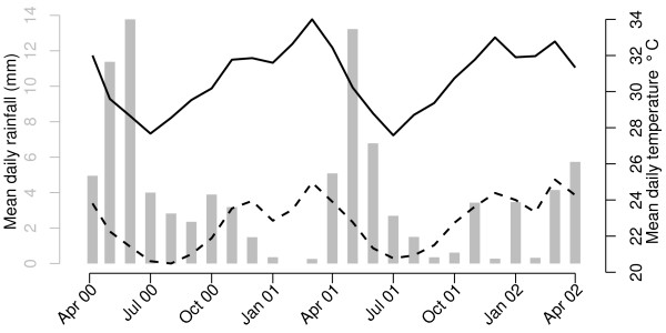
Figure 3.

Mean daily rainfall and temperature between April 2000 through April 2002 in Kilifi district, Kenya. The x-axis indicates time from 7 weeks before the start of the study period through to the end in accordance with the maximum and minimum lag periods considered in the statistical model (see main text). The grey bars indicate the mean daily rainfall whose scale is given by the grey y-axis on the left hand side. The black solid and dashed lines indicate, respectively, the maximum and minimum mean daily temperatures whose scale is given by the black y-axis on the right hand side.
