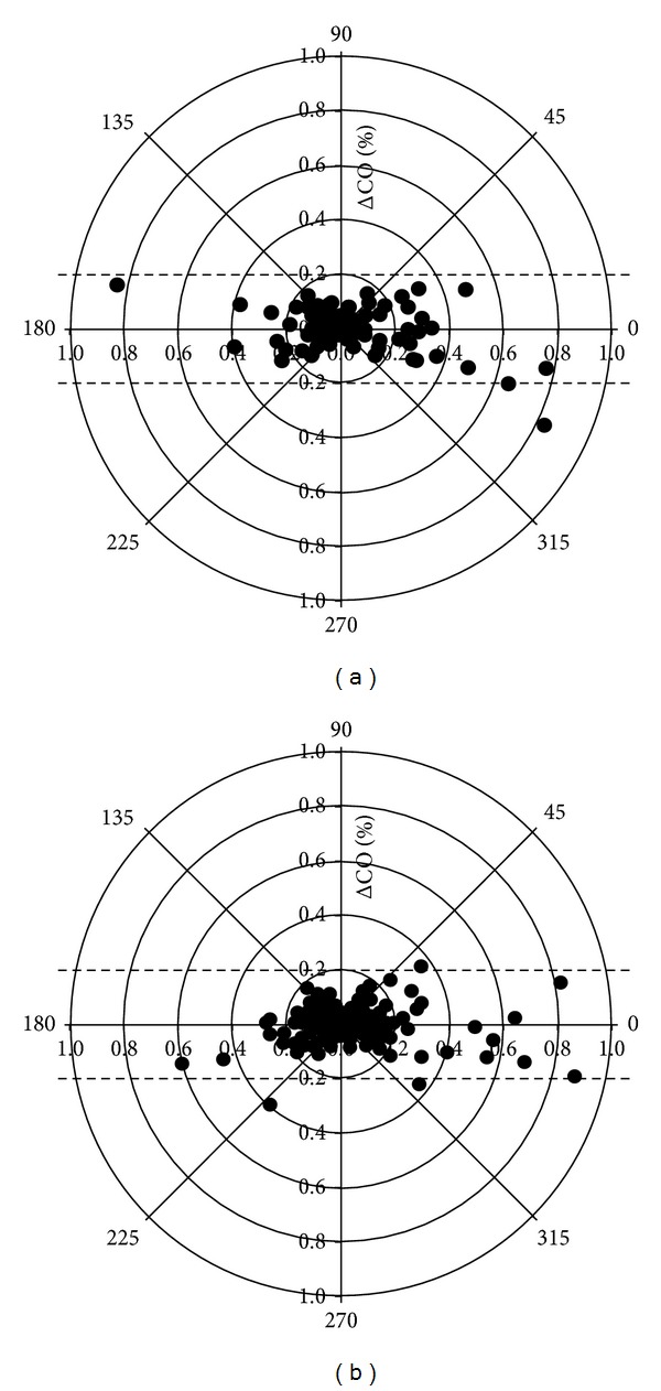
Figure 4.

Polar plot. The distance from the center of the plot represents the mean change in cardiac output (ΔCO, expressed as %, with 1,0 referring to 100% change from baseline) and the angle θ with the horizontal (0-degree radial) axis represents agreement. The less the disagreement between CO measurements, the closer data pairs will lie along the horizontal radial axis. Data with good trending will lie within 10% limits of agreement. However, data with poor trending will be scattered throughout the plot and lie outside the limits of good and acceptable agreement (i.e., 10% and 20%, resp.). See text for explanation. (a) Polar plot for 90 paired measurements of mean ΔCO (%), calculated as absolute value of (ΔNeXCO + ΔTDCO)/2. From the 90 initial data 98.9% of the data points lie within the 20% lines and 89% within the 10% lines, suggesting acceptable trending capabilities. (b) Polar plot for 180 paired measurements of mean ΔCO (%), calculated as absolute value of (ΔNeXCO + ΔCCO)/2. From the 180 initial data 98.3% of the data points lie within the 20% lines and 88.9% within the 10% lines, suggesting acceptable trending capabilities.
