
Figure 3.
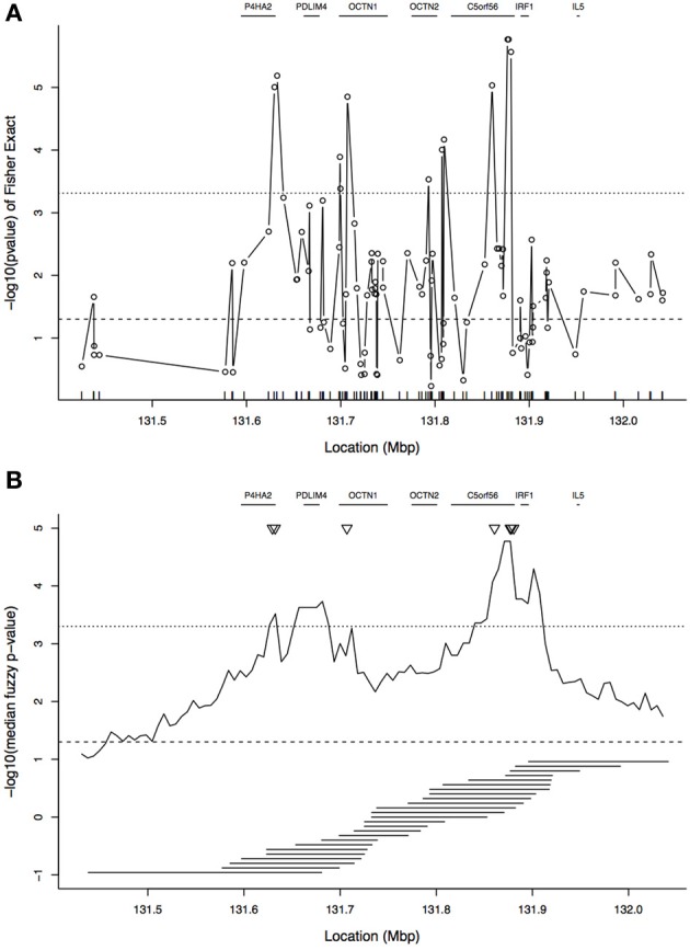
Plot of association results in the 5q31 region. (A) Single-SNP analysis: plot shows −log10(p-value) from Fisher's exact test of association between allelic state and case/control status. The tickmarks at the base of the plot show the locations of the SNPs. (B) Tree-based analysis: −log10 of the median of the fuzzy p-value by focal point. In (B), the tiled horizontal line segments under the association curve show the window spans for every second focal point. In both panels, gene locations are indicated at the top of each panel. The horizontal dotted line near y = 3.3 indicates a p-value of 0.05 after Bonferroni correction, and the horizontal dashed line near y = 1.3 is the uncorrected p-value threshold of 0.05. The Bonferroni correction for (A) is based on 103 SNPs and for (B) it is based on 100 focal points. The triangles in (B) correspond to the peaks of (A).