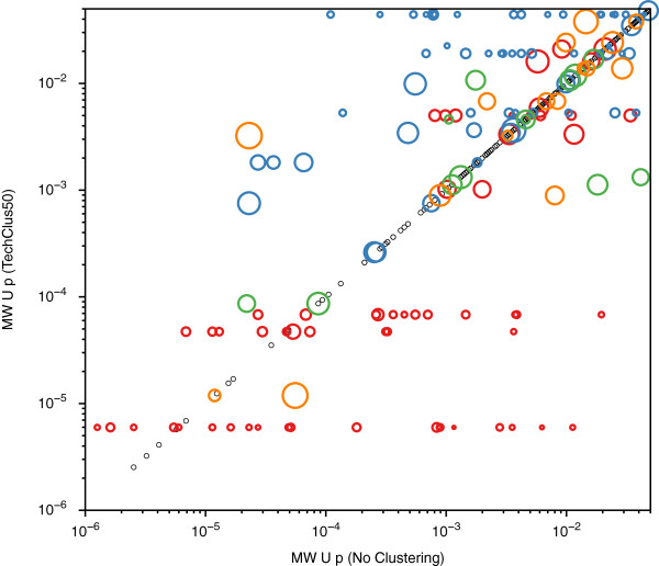
Figure 7.
Comparison of Mann–Whitney U test results before and after technical clustering. The Mann–Whitney U test results for the original data are plotted on the abscissa, and the U test results after technical clustering at threshold 0.5 are plotted on the ordinate. For convenience of viewing, two peaks with p < 1 × 10⁻⁷ and 972 peaks with p > 0.05 are not plotted. Peaks with p < 0.05 that do not cluster at variance threshold 0.5 are represented as small black open circles, and fall on the diagonal. The clustered peaks with p < 0.05 are represented as a bubble plot, with the area of the bubble being proportional to the weight (contribution) of that protein peak to that cluster’s centroid. For viewing convenience, clusters have bubbles of different colors.

