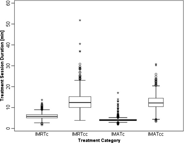
Figure 1.

Box-and-whisker plots of the distribution of treatment session times for each treatment category. Whiskers denote the nearest values <1.5 times the interquartile range (IQR), open circles beyond the whisker lines (o) indicate individual outliers (<3.0 times the IQR), and stars (*) signify extreme values (>3.0 times the IQR).
