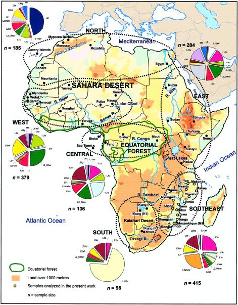
Figure 1.
Map of Africa showing the samples used in the present work. The pie charts represent the haplogroup composition of the main African regions, combining some sub-clades for convenience, and excluding the contribution of haplogroups of non-African origin. Population codes are as defined in table 1.

