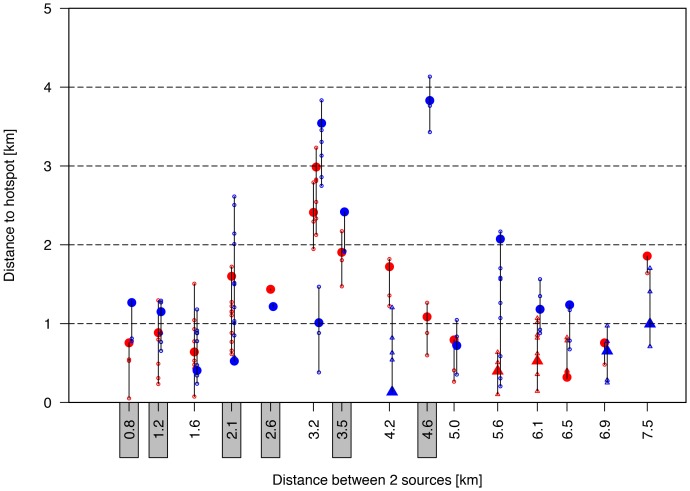
Figure 4. Two source simulations with the distance from the two sources to their closest hotspot as function of the distance between the two sources.
The one source is indicated in red; the other in blue. The distance to all grid cells with nMR>0.9 is listed by small open circles; the grid cell with the maximum nMR-value in the hotspot is indicated by a large closed circle. If a local maximum with nMR-values<0.9 appeared, then triangle symbols are used, taking into account all grid cells with nMR-values of 0.10 lower than the local maximum. If a source could not be attributed to a single hotspot, then the distance to both hotspots was indicated (e.g., at x = 3.2 km). Results with just one hotspot are indicated by the grey rectangles at the x-axis.

