
Figure 4.
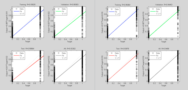
Comparison of data dependence analysis for control model (left) and new model (right). In both graphs, the horizontal axis indicates the objective output value of the model training; the vertical axis shows the model output values. Blue curve represents the current training model data correlation in the process of neural network building; green curve represents the data correlation under cross-validation data, red curve is the corresponding model correlation with test data (sampled from the neural network training set by removing the extraordinarily good or poor models as outliers).