
Figure 5.
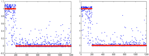
Comparison of classification between the control model (left) and the new model (right). In both graphs, the horizontal axis indicates the data sample numbers, and the vertical axis is classification value. Blue indicates the actual output value of the model, red indicates the objective (target) value.