
Figure 4.
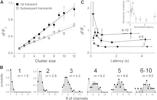
Amplitude distributions and latencies of initial events. (A) Mean amplitudes of initial (solid squares) and subsequent Ca2+ events (open circles) as a function of cluster size for sites (n = 381) where ≥ 4 events were observed. Solid lines represent linear regression fits, 95% confidence intervals are shown as dotted lines (initial events slope = 0.09 ± 0.01, R2 = 0.98; subsequent events slope = 0.05 ± 0.01, R2 = 0.93). (B) Amplitude distributions of initial events grouped by relative cluster size (indicated in bold above each graph). Experimental observations are shown as black symbols and lines. Gray histogram bars denote Poisson fits to the data, calculated from the mean numbers of channels (m) opening during an initial event in excess of the initial “trigger” channel. (C) Relationships between amplitude and latency of first-events. The main graph shows mean first-event amplitudes (ΔF/F0) plotted against latency for sites with relative cluster sizes of 2 (triangles), 4 and 5 (squares), and 6 to 10 (circles). Points are mean ± 1 SEM after binning measurements across time intervals chosen to include similar numbers of events (5–15). The inset shows pooled data from all 381 puff sites after normalizing first-event amplitudes at each site to the mean amplitude of all subsequent transients observed at that site, and normalizing first-event latencies to the mean interevent interval at that site.