
Figure 5.
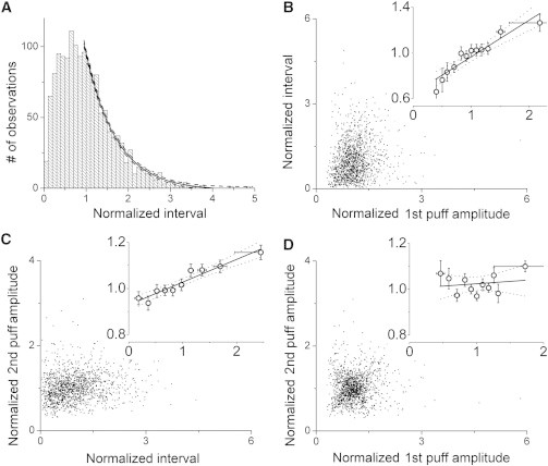
Interactions between puff amplitudes and interpuff intervals during repetitive trains of puffs. Blips were excluded from analyses in this figure. (A) Distribution of normalized interpuff intervals showing pooled data from 381 puff sites where ≥ 4 events were observed. Each interpuff interval was normalized relative to the mean interpuff interval at that site. The solid curve is a single-exponential fit; dashed curves indicate 95% confidence bands. (B and C) Scatter plots showing relationships between puff amplitudes and interpuff intervals. Puff amplitudes are normalized relative to the mean amplitude of puffs at that site, and intervals are normalized to the mean interpuff interval at that site. In each panel the main graph shows individual measurements, and the inset graph shows mean values replotted on expanded scales after binning across intervals on the x axis. Horizontal error bars denote ± 1 SD, to indicate the range of values used for binning. Black lines indicate regression fits, with 95% confidence intervals represented by dotted lines. (B) Relation between amplitude of a puff and the duration of the following interpuff interval. A linear regression fit to the data gave a slope of 0.32 ± 0.04; R2 = 0.87, P < 0.0001. (C) Relation between interpuff interval and amplitude of the following puff. Regression analysis gave a slope of 0.10 ± 0.01, R2 = 0.87, P < 0.0001. (D) Relation between the amplitude of a puff and the immediately following puff. Regression analysis did not reveal a significant correlation; slope = 0.05 ± 0.03, R2 = 0.12, P = 0.09.