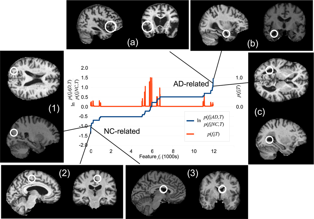
Fig. 1.
The blue curve plots the likelihood ratio ln of feature occurrence in AD vs. NC subjects sorted in ascending order. Low values indicate features associated with NC subjects (lower left) and high values indicate features associated with AD subjects (upper right). The red curve plots feature occurrence probability p(fi|T). Note a large number of frequently-occurring features bear little information regarding AD or NC (center). Examples of NC (1–3) and AD (a–c) related features are shown.

