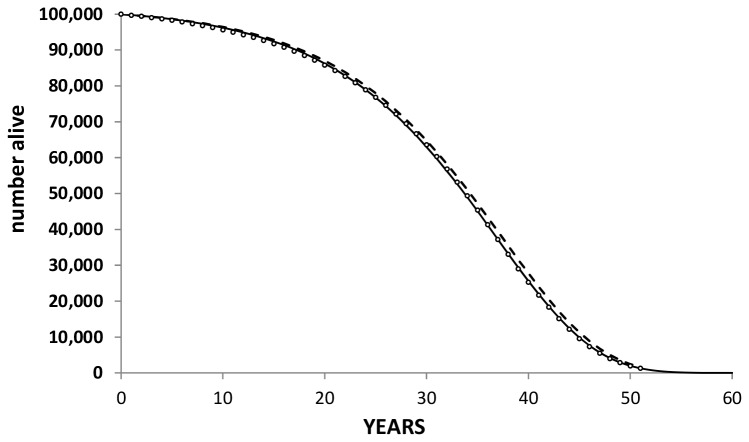
Figure 3. Gompertz fit to the ONS data.
Symbols represent the UK ONS survival for 50 year old individuals; the solid line is a Gompertz fit to the ONS data; the dashed line represents the survival of aspirin users based on a ten year OR for all-cause mortality of 0.94 (Seshasai [38] & Berger [19]) and modelled keeping the scale parameter for the Gompertz fit constant. The difference in area under the solid and dashed curves represents the mean gain in life over a life time horizon.

