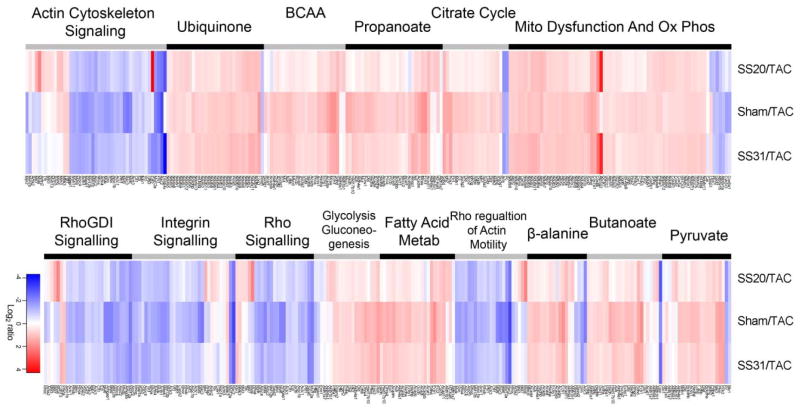
Figure 5. Heat map of abundance ratio of the top canonical pathways from Ingenuity Pathway Analysis.
The abundance ratio of each component proteins of a pathway is colored red when higher in the SS-20, sham or SS-31treatment (numerator) than in the saline-TAC (denominator) in the ratio comparison. The color is blue for the converse. The top 15 canonical pathways are ordered from most significant (top of left set) to least (bottom of right set) Any protein that was significant in any one or more of the three ratio comparisons is included in the heat map. The intensity of color indicates the magnitude of change, with the scale shown at the bottom.

