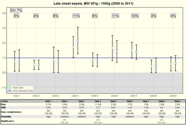
Figure 2.

Quality indicator chart. Example QI-chart (Late onset sepsis) with a diagram above and a table below. The diagram is based on the standardized mortality / morbidity ratio model and compares each unit (1–9) with the combination of all level III NICUs in Switzerland (CH). The rate of the entire collective (CH) is set as 1 and is compared with the unit’s observed relative raw rate (diamond) or its risk-adjusted (currently only gestational-age adjusted) observed vs. expected rate (square). A missing overlap of a 95% confidence interval marks a significant difference between a unit and the entire community. The table below lists the detailed rate, SMR, data completeness, reliability and whether the difference is significant (as this is not always clearly visible in the diagram). The rate of the entire collective (CH) is in the top left corner of the diagram.
