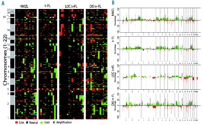
Figure 2.
Heatmap (A) and frequency plot (B) of gains and losses of all analyzed samples. (A) Heatmap of aberrations of all analyzed tumors per group. Green represents a gain, red a loss. Black/gray bar represents the chromosomes. (B) Frequency plots for NMZL, translocation-negative (t−) FL, localized translocation-positive (LOC t+) FL and disseminated translocation-positive (DISt+) FL. The y-axis represents the percentage of aberrations and the x-axis shows the genomic location. Focal aberrations are indicated in black.

