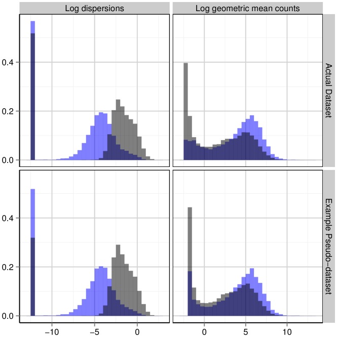
Figure 1. A look at the data.
Hammer data and Hammer-generated pseudo-data are in blue, while Pickrell data and Pickrell-generated pseudo-data are shown in black. The top two panels show the gene-wise log geometric mean counts and log dispersion estimates, estimated with the QL method, for the Hammer and Pickrell datasets. The bottom two panels plot the analogous quantities for example simulated pseudo-datasets, except that the log dispersions plotted are the true dispersions used to simulate the pseudo-counts and the gene-wise log geometric mean counts are the  ’s (log geometric mean counts from the real data) used in the simulations. The vertical bar at around
  in the plots of the log dispersions is an artifact of the QL method, which sets extremely low dispersions (i.e., dispersions of non-overdispersed genes) to a common minimum value.

