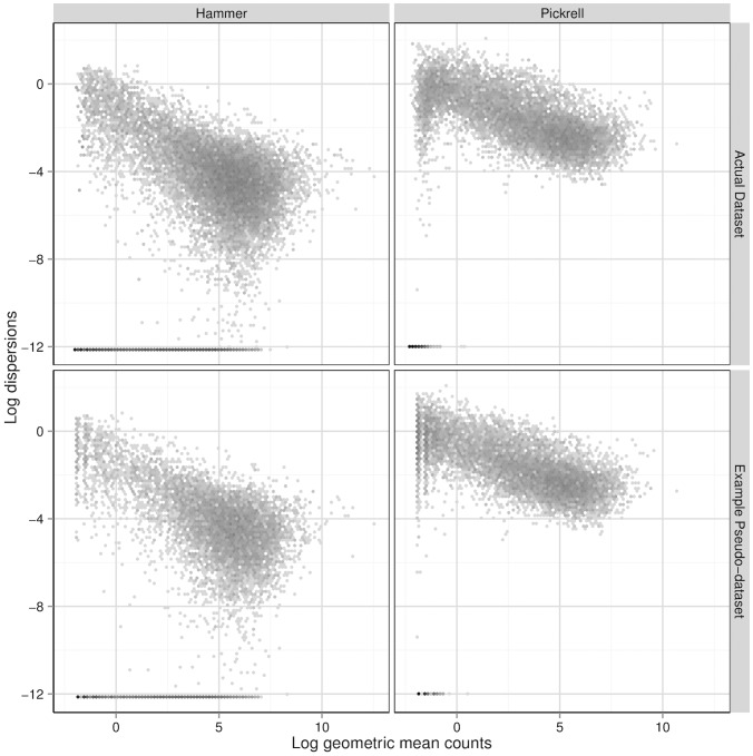
Figure 2. Dispersion-mean relationships.
The top two panels show the relationship between the log QL-method-estimated dispersions and the gene-wise log geometric mean counts of the Hammer and Pickrell datasets. The bottom two plot the analogous quantities for example simulated pseudo-datasets, except that the log dispersions plotted are the true log dispersions used to simulate the pseudo-counts (i.e., the  ’s) and the gene-wise log geometric mean counts are the
  ’s used in the simulations. Bins in these two-dimensional histograms are shaded by their log frequency.

