
Figure 6. In-Hospital Mortality of Infectious Endocarditis.
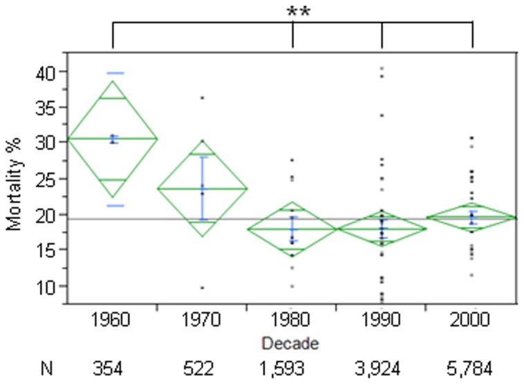
Figure shows percentage of in-hospital mortality of Infectious Endocarditis in each decade (mean in green, centerline of diamond) and variance (as size of diamond) plus standard deviation (blue). Each dot in column represents a particular study mean. N below decades represents total number of patients in each decade. In-hospital mortality decreased after the 1960s and remained stable thereafter. ∗∗=p<0.01.