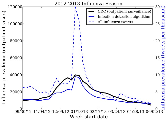
Figure 2. 2012-2013 national influenza rates from Twitter and CDC surveillance.
This figure shows national influenza rates of the United States as predicted by two Twitter-based algorithms alongside the influenza-like illness surveillance network data from the US Centers for Disease Control and Prevention (CDC). The dashed blue line is the measure estimated by a simple model of keyword matching, while the solid blue line is the measure estimated by our new infection detection model. Our new algorithm more closely matches the CDC data (solid black line), while the simpler keyword model infers spurious spikes due to other Twitter chatter, e.g. in early December and early April.

