
Fig. 1.
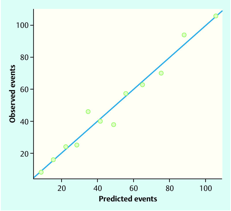
Observed and predicted frequencies of lymph node status. Patients were ordered according to the predicted probability of a positive lymph node status by the final logistic regression model and grouped into 12 categories based on percentiles. Observed positive lymph node status in each category and summed-up predicted probabilities for a positive lymph node status (“predicted events”) in each category are shown. Points below the blue line indicate when the model over-estimates the risk of lymph node positivity, points above the blue line indicate when the model under-estimates risk. A perfect prediction model would have all points on the blue line.