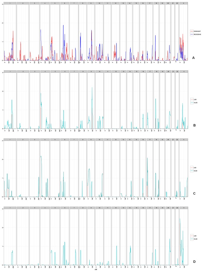
Figure 1. Plot of LOD / HLOD*.
a) Plot of HLODs for all families in the study, dominant (in Red) and recessive (in Blue) models (n=121).
b) LOD/HLOD plot of study group with more than 3 affected individuals (n=27).
c) LOD/HLOD plot of study group with mean age of diagnosis < 50 (n=8).
d) LOD/HLOD plot of study group with affected sibs (n=49).
* -negative values of scores are not plotted shown.
For b,c,d - LODs are represented in Red, HLODs are represented in Cyan.

