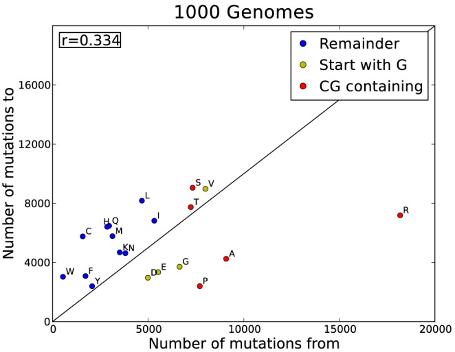
Figure 4. A visual representation of the asymmetry of the 1 kG data.

The plot shows the difference between how often an amino acid mutates vs how often it is mutated to. These are raw counts and also reflect the frequency of occurrence. Each amino acid is coloured according to CpG content. Red: a CpG dinucleotide occurs in its codons; yellow: if one of its codons start with a G (with a C possibly preceding it); blue: no CpG in its codons. The black line indicates the diagonal where ‘mutations to’ equals ‘mutations from’.
