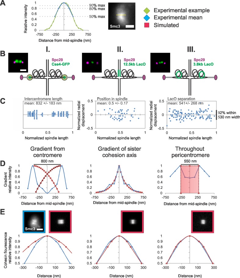
FIGURE 4:
Modeling the distribution of cohesin molecules along the spindle axis. (A) An example line scan (green) along the lobe of an experimental image of the cohesin barrel (yellow dotted line). The experimental mean (blue) at 90, 80, and 50% maximum intensity is overlaid on to the example line scan. (B and C) Experimental data of fluorescent labels were used (D) to build different models of cohesin distributions and (E) compare simulated model fluorescence with experimental cohesin fluorescence distribution. (B) Diagram of experimental label positions (green) relative to the pericentric chromatin (black loops) in spindle. (C) Experimental data of (I) centromere clusters via Cse4-GFP, (II) sister cohesion axis via 12.5-kb LacO/LacI-GFP, and (III) pericentromere chromatin via 3.8 kb-LacO/LacI-GFP relative position in a normalized spindle (n = 36, 43, and 60 cells, respectively). (D) Experimental data (blue) were used to generate simulated gradients or cylinders (red) relative to a normalized spindle. (E) Graphs show the average change in relative intensity along the length of a cohesin barrel lobe in simulations (red, n = 50) compared with experimental (blue, n = 33). Cohesin barrels (550-nm length, 500-nm diameter, and 50 nm thick) that have been randomly filled with the measured number of fluorophores (240), best recapitulate experimental cohesin fluorescence along the barrel (MLE = 0.80–1.01; see Table 4). Scale bar: 1 μm.

