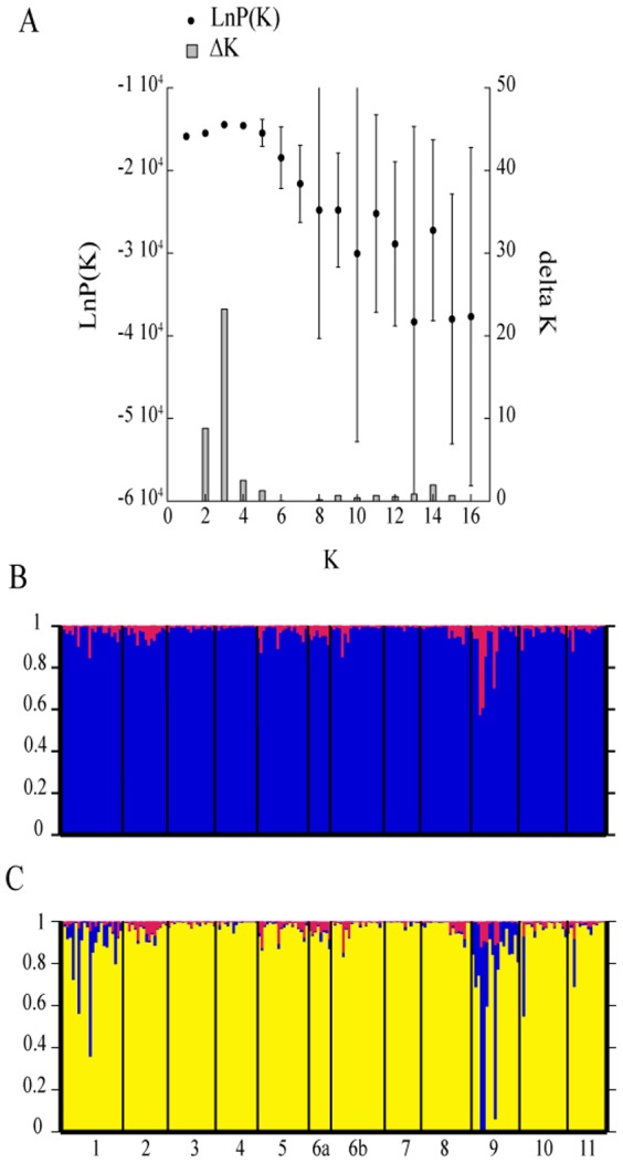
Figure 2. Summary of the results from the STRUCTURE analysis.

The analysis was performed using the admixture model allowing for correlated frequencies: Graph of LnP(K) (black dots) and ΔK (bars) for the different K population assumptions (A). Bar plots representing the population assignment of the individuals for the assumption of K = 2 (B), K = 3 (C).
