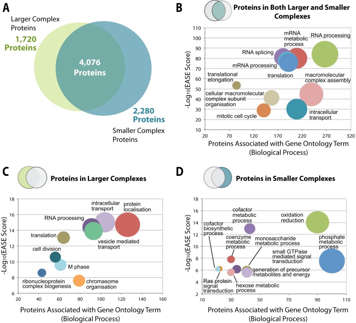
Fig. 5.
Comparative analysis of higher and lower molecular weight complexes. A, the proportions of proteins identified in the SEC dataset that correspond to “larger complex proteins” (eluting in fractions 7–23) and “smaller complex proteins” (eluting in fractions 24–40) are presented as a Venn diagram. The overlap represents proteins that eluted in both larger and smaller complexes. B–D, bubble graphs demonstrating the top 10 gene ontology terms (biological process) (x-axis) plotted against the −log10(EASE score) for proteins eluting in both larger and smaller complexes, in larger complexes, and in smaller complexes, respectively.

