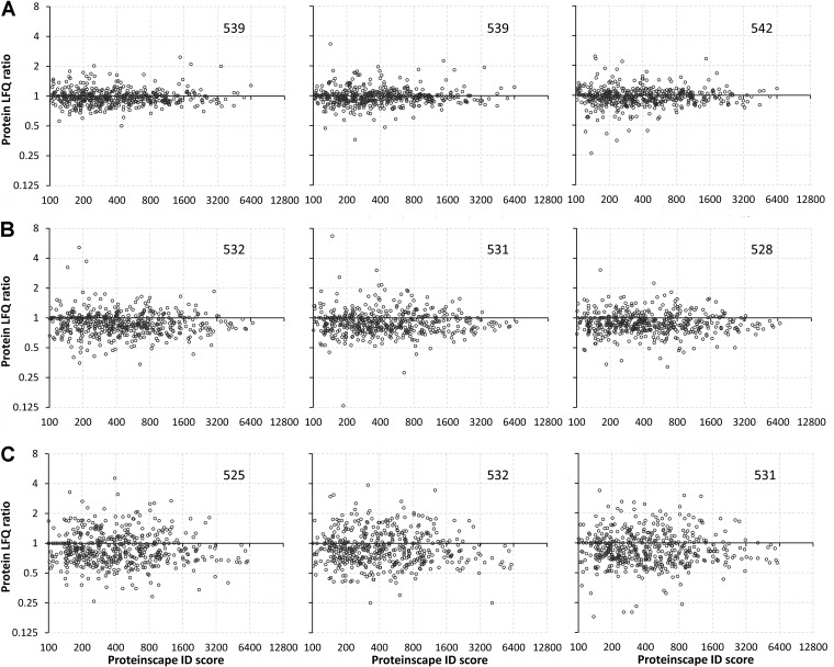
Fig. 4.
Global profile of salinity effects on the gill proteome. Each graph depicts the protein LFQ ratio (= mean protein abundance in treated/mean protein abundance in controls) on the Y axis and the protein identification (ID) score obtained with Proteinscape 3.1 on the X axis for every identified protein. The number of identified proteins is depicted in the upper right corner of each graph. Note that all axis scales are plotted as Log2. Three technical replicates (= separate LCMS runs of the same set of samples) are shown for fish exposed to A 34 ppt, B 70 ppt, and C 90 ppt (relative to the corresponding FW handling controls).

