
Figure 5.
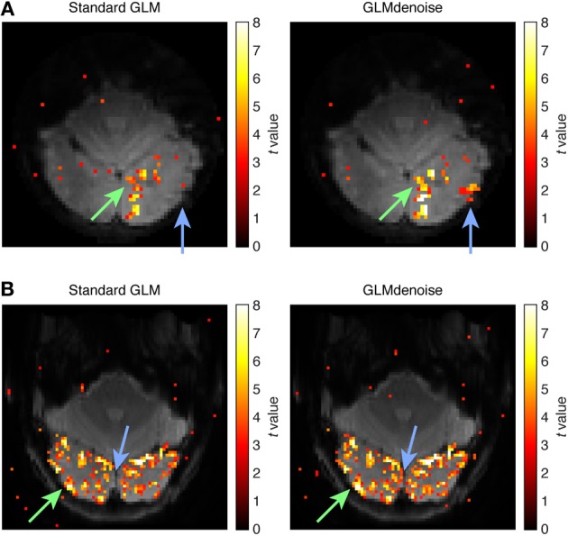
Example activation maps. As an intuitive way to visualize SNR improvements, we show maps of t-values obtained using Standard GLM and maps obtained using GLMdenoise. Maps have been thresholded at t > 3 and are overlaid on the mean functional volume. (A) Activation map for dataset 3, slice 11, condition 31. The green arrow indicates an activated region that exhibits substantial increases in t-values when using GLMdenoise. The blue arrow indicates a region that exhibits activation under GLMdenoise but not under Standard GLM. (B) Activation map for dataset 7, slice 11, condition 24. Format same as (A).