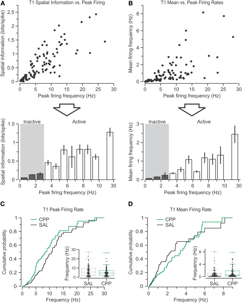
Figure 4.
Definition of active and inactive single units. (A) Top, scatter plot showing spatial information vs. peak firing rate for all putative pyramidal cells from the SAL group recorded in T1 (n = 103). Bottom, bar graph (mean ± s.e.m.) with the data binned into 1-Hz groups (with an average of 7.8 units per bin) shows the boundary between inactive (gray area) and active units. Notice that cells with peak firing rate >10 Hz are grouped into a single bin. (B) Top, scatter plot of mean firing rate vs. peak firing rate of all SAL units in T1. Bottom, bar graph (mean ± s.e.m.) with the binned data also reveals the segregation of inactive (gray area) and active cells. All inactive units (except one) have a mean firing rate >1 Hz. (C) Peak firing rates for CPP (n = 97) and SAL units during T1, plotted as distributions of cumulative probabilities and box plots (inset), reveal no significant differences between groups. (D) Mean firing rates are also comparable among groups.

