Figure 7.
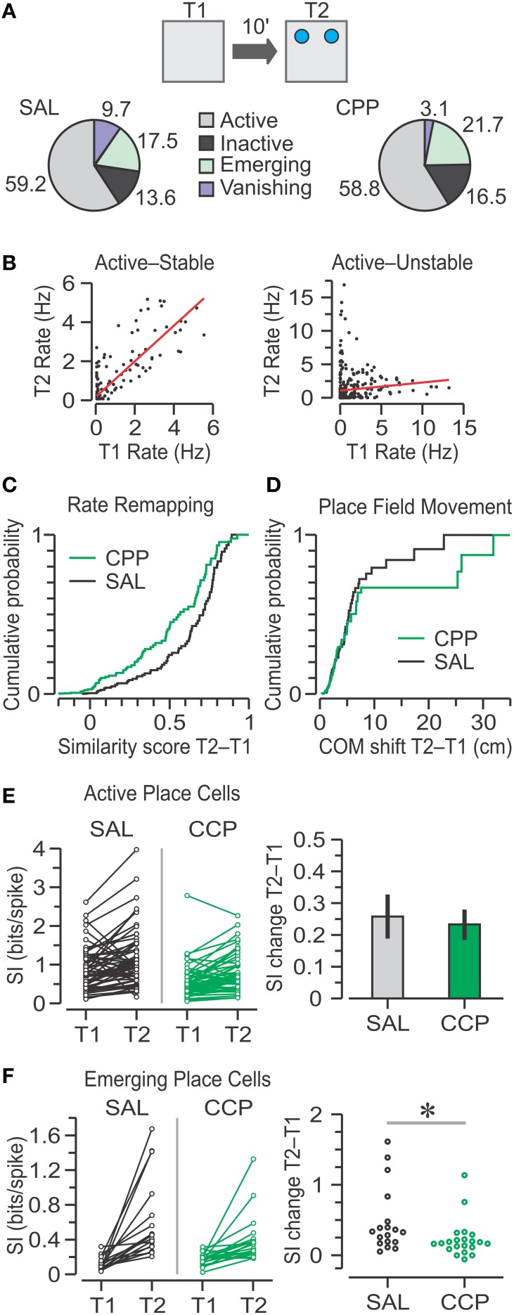
Place cell responses to object introduction in T2. (A) Top, schematic of the T1–T2 transition in the OPM task, with objects represented by blue circles. Bottom, pie charts with classes of units based on the activity between T1 and T2. Numbers represent the percentages of SAL (n = 103) and CPP (n = 97) units. The groups show no significant frequency differences (chi square-test). (B) Graphs of T2 vs. T1 mean firing rates for two active place cells, matched for all pixels occupied in both sessions. The red lines indicate linear regressions, which define similarity scores. The cell at left is stable because it has high correlation (r = 0.85), whereas the cell at right is unstable due to its low correlation (r = 0.09). (C) Distributions of similarity scores for active, emerging, and vanishing units for SAL (n = 88) and CPP (n = 81) groups show no statistical difference (P = 0.3, KS test). (D) Distributions of center-of-mass (COM) shifts in active units for SAL (n = 61) and CPP (n = 57) groups are not statistically different (P = 0.54, KS test). (E) Left, spatial information (SI) for active place cells in T1 and T2. Right, bar graph (mean ± s.e.m.) with SI change for active units indicating that both groups have significant increase above baseline (P < 0.001, one-sample t-tests), without statistical differences between groups (P = 0.76, t-test). (F) Left, SI for emerging place cells in T1 and T2. Right, SAL units (n = 18) undergo greater increase in SI than CPP units (n = 21). *, P < 0.005 (Mann-Whitney test).

