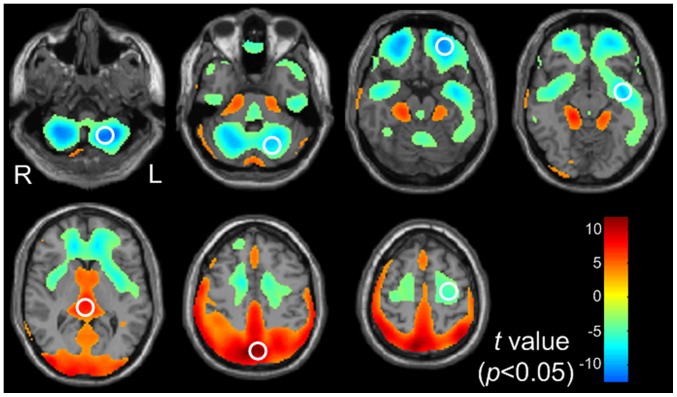
Figure 1. The gender difference maps of regional brain glucose metabolism.
Yellow to red areas represent regions where the values of glucose metabolism were higher in females than in males (corrected p<0.05) [height threshold of p<0.05 FDR corrected (T>2.26) and extend threshold of p<0.001 (cluster size > 30 voxels)]; The converse is shown as cyan to blue (corrected p<0.05) [height threshold of p<0.05 FDR corrected (T>2.26) and extend threshold of p<0.001 (cluster size >30 voxels)]. The white circles indicated the specific ROIs.

