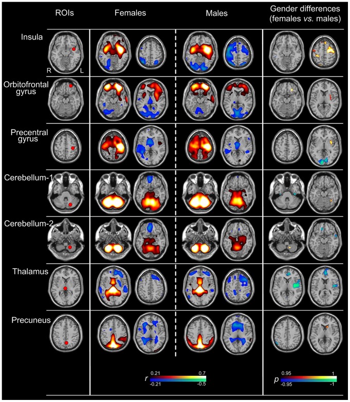
Figure 2. Seven specific brain glucose metabolic network maps of each gender and their differences.
The left column displays the locations of the ROIs. The middle two columns show the metabolic networks of both genders. The areas with warm color represented positive correlations with the ROIs, and cold color represented negative correlations (r>0.21, corrected p<0.05; height threshold of p<0.05, Bonferroni corrected, and extend threshold of p<0.001, cluster size >30 voxels). The right column exhibits the main areas of gender differences in brain metabolic networks. The areas with warm color represent increased functional connectivity with each ROI in females than in males; the converse is shown as cold color (corrected p<0.05; height threshold of p<0.05, Bonferroni corrected, and extend threshold of p<0.001, cluster size > 30 voxels).

