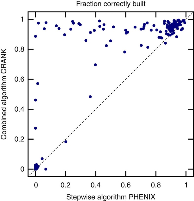
Figure 4. Comparison of PHENIX and CRANK’s combined approach.
The fraction of model correctly built by PHENIX compared with the new multivariate combined method on 147 data sets. Each data set is represented by a circle. The y axis plots the fraction of model correctly built using the combined algorithm, whereas the x axis shows the performance of PHENIX. The further a circle lies above the dotted diagonal line, the greater the improvement the new approach provides.

