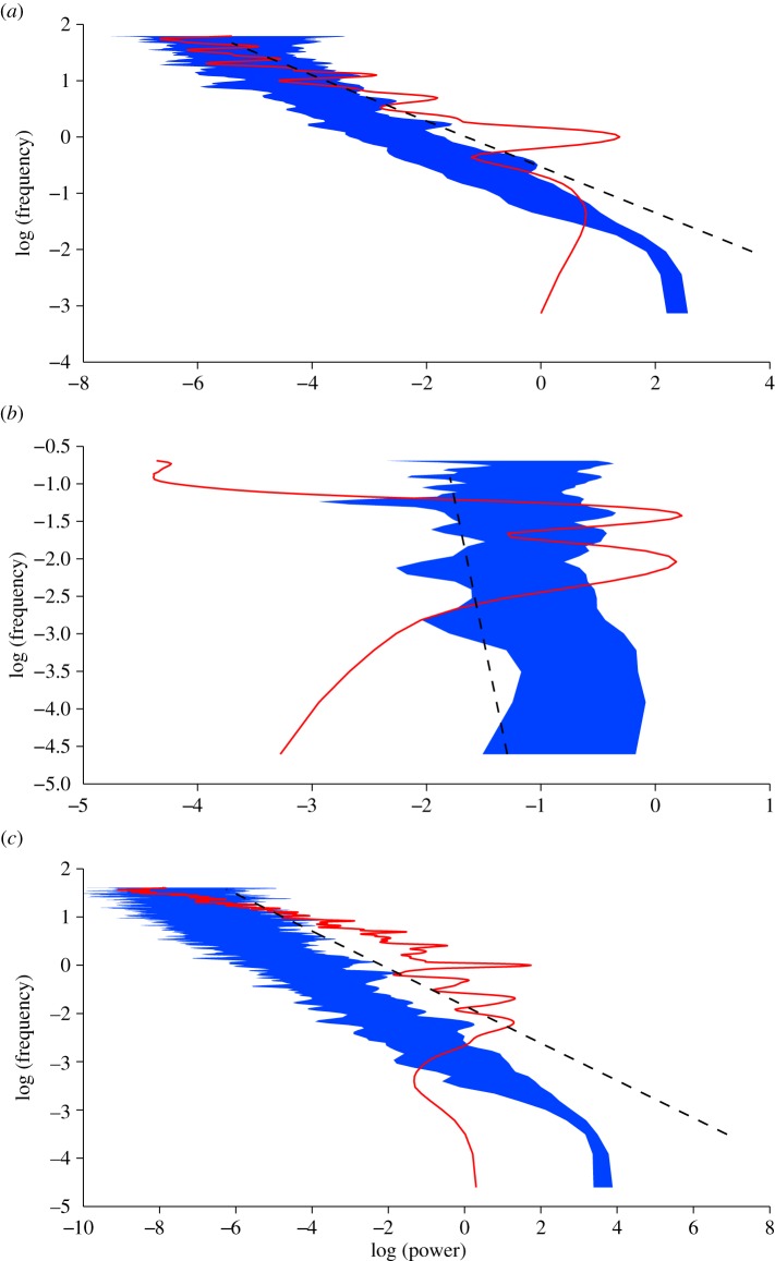
Figure 2.
The ‘beta-surrogate’ synthetic time series. On each graph, the black line is the Fourier spectrum of the raw time series on a log–log scale, the black dashed line is the slope of the Fourier spectrum, and the grey area is the envelop of the Fourier spectrum of 1000 synthetic time series. (a) Monthly number of reported cases of dengue haemorrhagic fever in Bangkok (figure 1a). (b) AR(2) time series (figure 1b). (c) Time-series of the infectious population generated by a chaotic SEIR model (figure 1c). (For the online colour figure: on each graph, the red line is the Fourier spectrum of the raw time series on a log–log scale, the black dashed line is the slope of the Fourier spectrum and the blue area is the envelop of the Fourier spectrum of 1000 synthetic time series.) (Online version in colour.)

