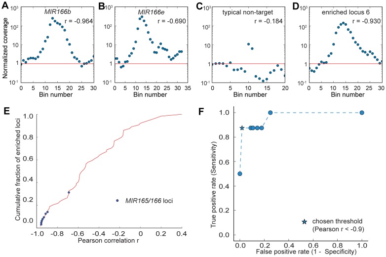
Figure 4. Targeted regions have a distinctive enrichment pattern.
(A–D) Each panel shows the normalized coverage at each 1 kb-sized bin centered on a highly enriched bin. Pearson correlation r of |x| and log(y) is shown, where x is the distance to the most highly enriched bin in the region and y is the normalized coverage. Red line indicates the genome average of the normalized coverage, which equals one. See Fig. S2 for full details. (A) Region surrounding MIR166b targeted locus. (B) Region surrounding MIR166e targeted locus. (C) A typical region surrounding a non-targeted locus. (D) Region surrounding enriched locus 6, which is not a MIR166 nor a MIR165 locus. (E) Cumulative distribution of the Pearson correlation r for all 64 highly enriched regions. Blue dots indicate targeted MIR165/166 loci. (F) Performance analysis to determine the optimized threshold of r to classify targeted and non-targeted regions. ROC curve is shown with varying threshold of r. Star-shaped dot indicates the chosen threshold of r = −0.9.

