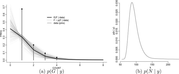
Figure 1.
T-cell diversity. Panel (a) shows the data (as pin plot) and a posterior sample F ~ p(F | y) under a DP mixture prior (grey curves) and the posterior estimate F̄ = E(F | y) (black curve). The plotted curves connect the point masses F(i) and F̄(i) for better display (the connection itself is meaningless). Panel (b) shows the implied posterior p(N | y) on the total number of T-cell types.

