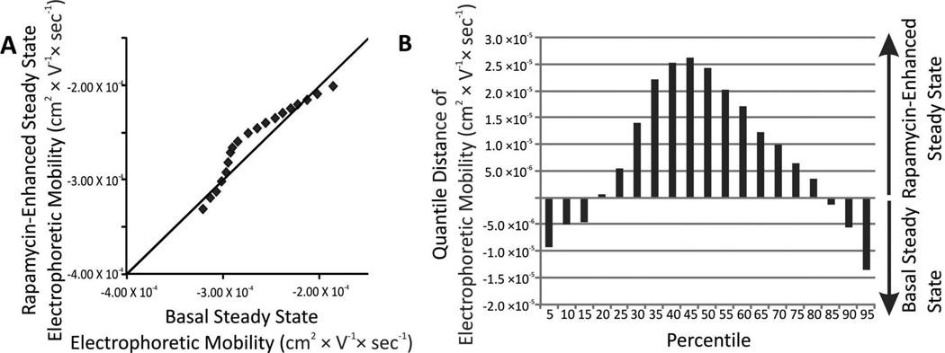
Figure 4.
(A) QQ plot of individual autophagy organelle electrophoretic mobility distributions. Comparison of distributions of individual electrophoretic mobility under basal (x-axis and rapamycin-enhanced (y-axis). Markers represent 5, 10, 15…95th percentiles. For percentiles with y = x, their electrophoretic mobility value is the same and should appear on top of the diagonal line. (B) Changes in the distributions of individual autophagy organelle electrophoretic mobility. The change for a given percentiles was calculated according to Equation 6.

