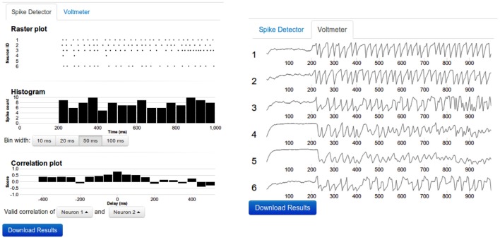
Figure 3.
Sample output. Left: The top panel shows the raster diagram of spikes of every neuron that was connected to a spike detector device. The middle panel depicts the Peri Stimulus Time Histogram (PSTH) of the population activity. The bottom panel shows the cross-correlogram of the activity of two neurons. The bin width of the PSTH and cross-correlograms are same. By clicking on the diagram, the data can be viewed in more detail. Right: The voltmeter view contains stacked thumbnails of all neurons which are connected to a Voltmeter device. On mouse-over, the voltage and time appear for the dot in the corresponding voltage diagram. By clicking one of the voltage diagrams, a zoom-in view can be obtained. In such zoom-in view, it is possible to resize or to shift the zoom window.

