. 2013 Dec 26;10:E214. doi: 10.5888/pcd10.130210

Figure 1.

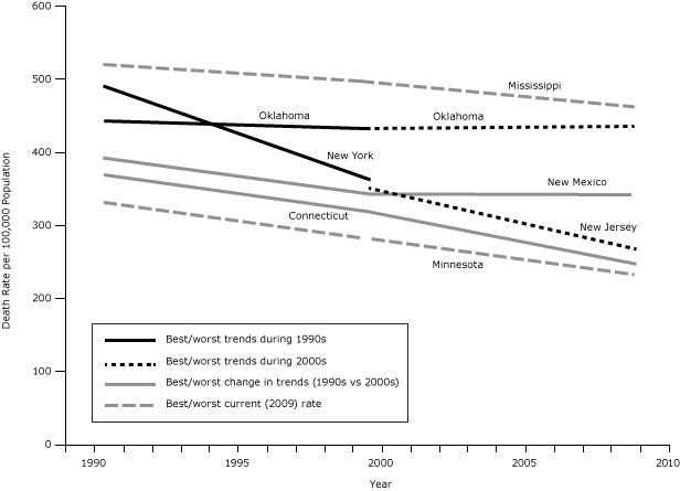
A line graph shows the trend lines for premature (<75 y, age-adjusted) death rates from 1990 to 2009 for the states ranked best and worst for current (2009) death rates (Minnesota, best vs Mississippi, worst); follow-up (2000s) trends (New Jersey, best vs Oklahoma, worst); and changes in trends from the baseline (1990s) to the follow-up (2000s) period (Connecticut, best vs New Mexico, worst).

Trends in premature (<75 y, age-adjusted) death rates from 1990 to 2009 for the best- and worst-ranked states, based on current (2009) death rates; follow-up (2000s) trends; and changes in trends from the baseline (1990s) to the follow-up (2000s) period. Data for this graph are available in the Table.