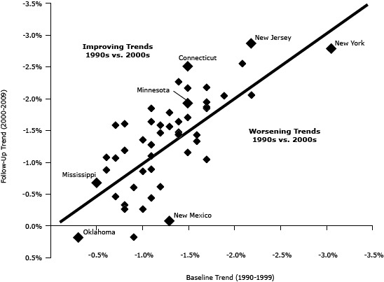
Figure 2.

Correlation between baseline and follow-up trends for each state. States in which trends improved are plotted above the line, and states in which trends worsened are plotted below the line. Each state is represented by a diamond. The states with the best/worst performance are identified. Data for this graph are available in the Table. Data source: Centers for Disease Control and Prevention’s Wide-ranging Online Data for Epidemiologic Research (WONDER).
